
A UI kit can give you editable designs, working component code or a nearly complete website. Those are very different starting points. Choose the thing you need to deliver before choosing the collection with the nicest preview.
If you’re designing screens for a developer, start with a kit for your design tool. If you’re building an app with a coding agent, choose components that fit its existing stack. For a public website, a template for your chosen builder—or a set of sections for your codebase—may get you closer than a dashboard kit.
Choose by what you need to deliver
The names on product pages overlap. “UI kit” sometimes means a Figma file and sometimes means a code package. Look for the actual deliverable, supported tool and edition.
| Starting point | Use it for | What it supplies | What remains |
|---|---|---|---|
| Design UI kit | Planning and reviewing screens in Figma or another design tool. | Editable components, styles and screen examples, depending on the edition. | Implementation. A clickable prototype is not a working app. |
| Code components | Building within a supported app stack. | Controls such as buttons, inputs, dialogs and tables. | Screen composition, data, rules and the behavior around those controls. |
| Page blocks | Assembling larger sections, often for a marketing website. | Composed heroes, navigation, pricing and FAQs. | Your content, integration and any behavior the selected block doesn’t supply. |
| Website template | Starting a site inside a chosen builder or framework. | A page structure, styling and sometimes configured CMS content. | Your offer, content, integrations, plan limits and a working visitor journey. |
| Theme or preset | Applying a visual style within a compatible system. | Colors, typography or other styling defaults; scope varies. | The screens and functionality. A theme is not automatically a template. |
A design system is broader than a collection of assets: it also needs agreed patterns and rules for using and maintaining them. Buying a kit can help start that work; it doesn’t establish those decisions for your team.
Useful places to start, by project
These are starting points for different jobs, rather than a ranking of interchangeable products. Inspect the exact edition before committing.
For a Figma design: a kit with reusable states
Untitled UI offers a Figma product and a separate React product. That distinction matters: a Figma purchase does not, by itself, mean you have the React code you need. Open the design preview and check your actual screen, including error, empty and long-content states.
For a free Figma dashboard, see the Flowbite Free and UKO Basic trial. Flowbite supplied editable table headers and cells. The two UKO Basic “Data table” pages inspected were image-filled rectangles, so the trial table had to be assembled from other components. If you need a table you can adapt, start with the Flowbite example.
UKO Basic’s example is useful for exploring layout and styles, but clarify its license before commercial use: the maker’s page says both “MIT license” and “only free for personal use.” Both trials show desktop and mobile designs, with supplied components separated from custom additions.

For an app built with AI: components that fit the project
shadcn/ui distributes component source you can adapt in your project. daisyUI provides component classes for Tailwind styling. Untitled UI React Free is another React option. The way you install and customize them differs, so the right choice depends on the code you intend to maintain.
Our three-library app comparison uses the same feedback-inbox task to show those differences. Start there if you want controls for a working app, rather than another screen mockup.
For a coded marketing page: assembled sections
If the project already uses shadcn, inspect the free Shadcnblocks, Shadcn Studio and Tailark Dusk selections. They cover a navigation, hero, pricing section and FAQ, with different amounts of behavior supplied. Choose the composition you want to keep, then test its first meaningful change.
For a builder website: templates for that builder
The Framer Marketplace and Webflow templates marketplace offer website starting points inside their respective products. Pick the platform before shopping for its template. Check the actual page types, CMS structure, mobile layout and required integrations; attractive screenshots don’t answer those questions.
If that platform decision is still open, compare Webflow and Framer for your website. Template costs and the platform’s hosting or publishing plan are separate things to check.
One product can need two different starting points
Imagine launching a small tool for collecting customer feedback. Its public website explains the offer and invites a signup. Its application lets people search requests, add one and see what happened. Both need good UI, but a pricing section is a poor substitute for a usable feedback form.
The application
Start with the existing app stack and controls. Evaluate adding a request, empty results, validation, failed saving and the detail view.
The public website
Start with the offer and page structure. Evaluate navigation, pricing, mobile reading and the main action all the way to its intended destination.
The examples below make the difference visible. They come from separate, documented Codex-executed trials with fictional feedback data. They are not Sebastian’s personal product tests, paid-library tests or a single connected production service.

In the app trial, a failed-save notice initially appeared behind the modal overlay. Moving the explanation inside the form and keeping the entered values fixed the problem. That was an integration mistake across the builds—not a reason to declare one library’s components unusable. It is also exactly the kind of issue a polished catalog screenshot won’t reveal.
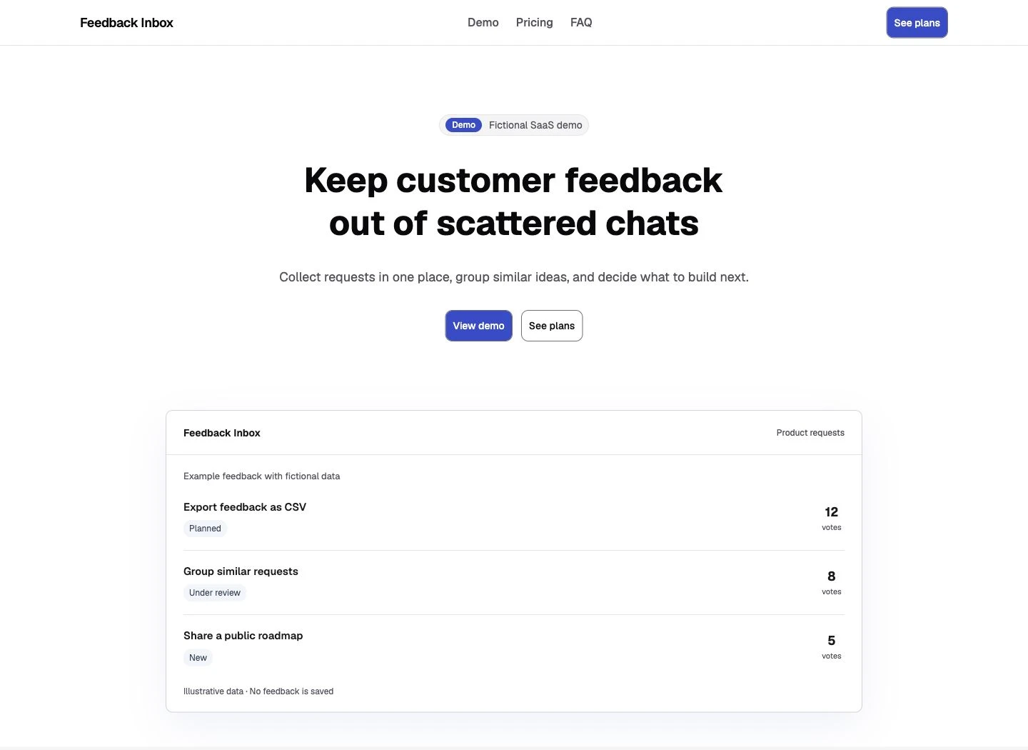
The marketing-page trial exposed another useful boundary. The selected Shadcnblocks and Studio pricing blocks supplied monthly/annual state. Tailark Dusk’s selected Pricing 2 was static markup, so that state had to be added. None of the three page builds created a real subscription checkout.
The practical question is: does the starting point cover the part of the product you actually need? You may reasonably choose one system for the app and another for the public website. Just keep the brand decisions coherent and understand that both still need implementation checks.
Give your coding agent the chosen library
An AI tool can produce a convincing screen while quietly mixing components, recreating controls or using imports that don’t exist in your project. Name the library, edition and existing setup in the request. Ask it to read the installed components before composing the screen.
A registry connection can help it find real source. In our official shadcn MCP trial, the server returned an install command; Codex ran it, composed the interface and checked the result. A usage example still needed its registry-internal import path mapped to the local component file. Connecting the server was one step in that workflow.
Keep the request concrete: “Use the installed dialog and inputs. Show an invalid submission and a failed save without losing my text.” That gives you something useful to inspect. “Make it look premium” leaves most of the important decisions unspecified.
If you’re choosing the AI environment itself, the vibe-coding tools guide separates browser app builders from agents for an existing repository.
Check one real screen before buying or installing more
Use the smallest screen that exposes your main requirements. For a customer dashboard, that might be a table, filters and a detail dialog. For a landing page, use the hero, navigation and main action.
- Match the deliverable and stack. Confirm file format, framework and required version. A similar-looking React demo does not prove a Figma file includes matching code.
- Put real content into it. Use a long customer name, a longer headline and an empty result. Check the phone layout with those values.
- Exercise the behavior. Use the keyboard, close the menu or dialog, submit an invalid form and check the failure state. A design file should show the intended states; code should demonstrate the interaction.
- Make a real change. Change the primary color and type scale, then add another repeated item or pricing plan. Check whether the change reaches custom styles as well as library controls.
- Read the exact license. Check seats, client handoff, paid-SaaS use and redistribution for the edition and dependencies. Don’t assume “commercial use” permits reselling the source as a template.
You don’t need to buy a premium library to run an initial check. Start with an available free selection or preview, and identify the specific missing component that would justify a paid purchase. Free components still leave implementation work; a paid catalog does too.
Copy a brief for evaluating one screen
Paste this into your project document or coding agent and replace the brackets. For a Figma-only candidate, use it to inspect the design states and record the implementation gap; don’t expect a code build from a design file.
Help me evaluate one UI starting point before I commit to it.

Deliverable: [Figma design / working app frontend / marketing website]
Existing design tool, framework and component library: [details]
Candidate and exact free/paid edition: [name, link and license]
One real screen or page to deliver: [describe the user and main action]

Use this candidate's documented components and setup. Show what is
supplied, what you will adapt and what you must build. Keep the current
library and tokens; don't quietly add a second UI system.

Use my real copy or clearly fictional records. Include a long title,
an empty state and an error where relevant. For a form, show validation
and a failed save without losing the entered values. For a marketing
page, connect the navigation and main action; don't fake a checkout.

Change the primary color and type scale, then add one longer item or
an extra pricing plan. Check the result on desktop and at 390px wide,
including keyboard navigation, dialog/menu focus and overflow.

For code, run the production build. For a design file, identify the
component states and implementation work still missing. Report the
changes, unresolved failures, dependencies and license questions.
Do not buy anything or publish the project.Questions that change the choice
Does a Figma UI kit include working code?
Only when that exact product explicitly includes it. A Figma library contains design assets and patterns. Even a bundle with code needs its framework, component coverage and implementation states checked separately.
Can a website template become my SaaS application?
It may help with the public website or frontend. It does not by itself establish authentication, server-side permissions, data storage or payment handling. Inspect the actual integrations and runtime before planning the application around it.
What if I already use shadcn?
First decide whether you need more sections or a different UI foundation. Use the blocks comparison for composed sections. Use the alternatives guide when you have a specific reason to replace the underlying system.
Choose the deliverable first, then test the first screen. For a coded app, start with the free-library comparison. For a SaaS marketing page, use the tested section selections. You’ll know what you’re adopting and which work is still yours.

