
.webp)
As per the recent Forrester survey, the conversion rate surged by around 200% for an intuitive UI, and the boosted conversion rate of an enhanced UX design is around 400%. It creates a demand for creative, seamless, and user-friendly sites, which is the need of the hour.
From choosing the relevant color palette to placing the design aesthetics on the right grid, you can improve the overall UI/UX design in many ways. But are those nuanced methods enough?
I bet not.
Here are 7 novel hacks to improve your UI/UX design for your website application without fuss.
Let’s get things started.
7 Proven Hacks to Elevate Web App UI/UX Design
1) Employ a research-driven UI/UX design strategy.
Robust user research lies at the heart of any groundbreaking UI/UX design. It's not just about giving users what's flashy or trendy; it's about truly understanding their desires, motivations, and behavior. And how do we do that? By putting ourselves in their shoes.
Start with the soul of your product: the end-user. Dive into the essential questions, like, who are they? What drives their choices? Are they hopping onto your web application after a tiresome day at work or during their fast-paced morning routine? These questions guide your design and create a connection—a human touch.
But wait, there’s more! It's not all about introspection; it's also about some healthy competition. Research your competitors. What are they offering that’s making users gravitate toward them? It isn't about copying but gaining insights and standing out. In the vast sea of similar web apps, offering a unique user experience becomes your golden ticket.
So, where to start, you ask? Begin by understanding your users. Delve into demographics, interests, and the apps they adore. Use tools like Google Analytics and Hotjar to gather data for those rich, vibrant user stories. And remember, it's not about the quantity of research but the quality. Engage, empathize, and elevate.
Your UI/UX design isn't just about aesthetics; it's a story told, a bond formed, and a journey shared. And trust me, a research-driven approach? That's your first steppingstone.
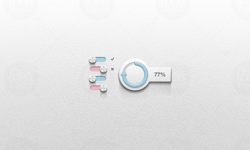
2) Prioritize Unity in Your UI/UX Elements Using a Comprehensive UI Kit.
In the realm of UI/UX design, the principle of unity plays a pivotal role in ensuring a seamless and cohesive user experience. As your web app evolves, it's crucial to integrate this unity across all design elements. While it's a foundational principle, it's not uncommon for designers to sidestep it as they delve deeper into product development, often in pursuit of meeting specific product requirements. But here's the catch: a disjointed design can muddle a user's journey.
To ensure that unity remains at the core of your design, consider using a comprehensive pre-designed UI kit. Such design systems are designed to emphasize the principles of unity while crafting specific functionalities in UI/UX design. Whether it's about maintaining a consistent proximity between elements or ensuring a logical flow with continuation, every design decision should be a reflection of your brand, serve its intended function, and ultimately, cater to the user's needs.
Sounds interesting.
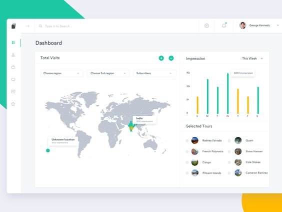
Be it proximity or continuation, your element design must confer on the brand, function, and serve the user at large, like in the image below, for example:
3) Use white space to your advantage.
We cannot stress enough the use of white space in good web app design. As a UI/UX designer, you should prioritize minimizing the number of prominent elements, CTAs, designs, and functionalities on the screen.
Too many items on a web app are overwhelming. They make the learning curve daunting. White space, on the other hand, makes your UI lucid, thus making the design more intuitive.
But do not confuse white space with blank space in your web app design. It also refers to the spacing between text and different elements. Good use of white space simplifies data consumption and makes your web app more ‘usable.
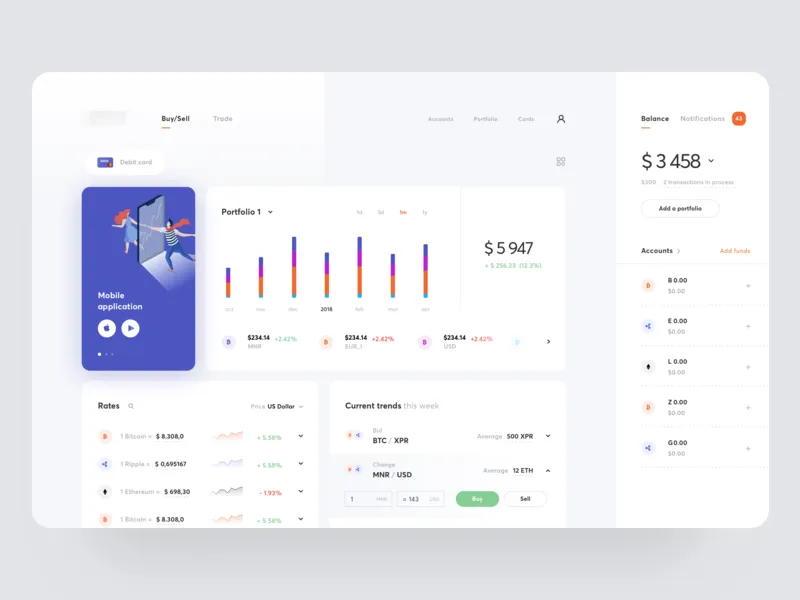
See it for yourself:
4) Judicious use of appealing CTA buttons
Users navigate your web app through CTA buttons to go through different screens to complete their desired actions. Thus, CTA buttons are the most important links in your web app’s navigation, and here’s what you need to keep in mind:
- Your CTA buttons must complement the logical flow of the user's actions.
- The CTA buttons must leverage contrast to ensure good visibility.
- The number of CTA buttons prominently visible must be minimal for user actions.
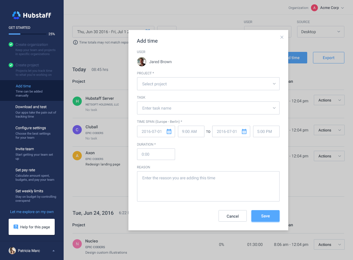
Here’s an example:
That was amazing, right? But here’s something you should take care of when implementing the above advice:
- CTAs should provide the utmost clarity on what action will be performed.
- Their positioning should follow the principles of visual hierarchy, and the information around them must complement the placement.
- CTAs should limit choices as opposed to providing choices. Use the workflow to provide choices instead.
- Keep the mobile version in sync with the functional aspects of your web app. Simple repackaging without special consideration for CTA buttons will leave your web app experience in shambles during cross-device usage.
5) Play smart with the content and its formatting.
At times, displaying what we would otherwise consider an ‘overdose of content’ on your web app becomes necessary. But there are intelligent ways to handle too much information—working on the content and its formatting.
Here’s how you can make your dashboards with excessive information look more ‘presentable.’
- Structure your content placement to meet user workflow.
- Combine similar tasks and actions and use separate screens for each group of tasks/actions.
- Use truncation for descriptive content whenever you need to display such information.
- Use progress bars and icons for displaying undone tasks or unseen messages.
- Highlight the current action area (widget).
- Use horizontal lines, containers, boxes, and borders to separate similar pieces of information.
- Prioritize displaying structured information through hamburger menus and drop-downs.
- Use the color scheme to direct the user’s attention.
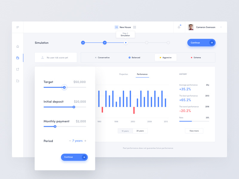
You can see an example of these tips in action here:
Limiting the components of the web app UI is generally better, but simultaneously, you must serve the UX according to the user's expectations. For advanced users, having all the necessary data on the screen is valued more than simplicity. In contrast, the ability to make data-driven decisions is valued more than having all sorts of data at once. So?
6) Use color contrast to your advantage.
While you must know about color theory, its psychological impact, and accessibility best practices, you must also use colors to your advantage.
Like ‘elements,’ you can use colors in your UI/UX design to prioritize elements like calls to action, notifications, or errors. For instance, you can mute the background to guide the user’s attention toward a particular button or widget.
Similarly, you can use your color scheme to create a visual hierarchy. Think of using vibrant colors to denote urgency or importance while using low-contrast information for secondary information, like in this screen:

Don’t get too carried away with this tip, though; it sometimes leaves you susceptible to violating your brand toolkit and readability. Hence, you should pay more attention to overlays and backgrounds when playing with color-led visual hierarchy initiatives in UI/UX design.
At the same time, you must follow the below tips for color-led UI/UX optimization purposes:
- Use a color contrast checker to test the contrast ratio of your colors. There are tons of free online color contrast checkers available.
- Get feedback from users.
- Be patient and iterative. Experiment with color combinations and find the best for your web app.
7) Tackle page speed issues with clever animations.
While page speed leans towards the engineering part of web app development, it is a must for UI/UX designers to keep it at optimal levels. Today, page loading speed and aesthetics are the two most significant factors in software adoption and user retention as the number of vendors for each category grows.
It’s possible to have lightning-quick pages on your web app. Solution? Clever use of animations! It would be best to use beautiful animations to keep your users informed and engaged while the ‘slow’ page loads and your web app becomes instantly more user-friendly.
Love the above example?
You can do much more: use randomized animations with facts and stories related to your product or industry. Or even better, you can gamify your page loading screen!
Remember, nothing substitutes lacking speed better than keeping the user engaged, especially when doing critical tasks using your web app.
Wrapping Up
While you may target having an invisible UX, it is necessary to understand that your ideal UX will develop over time as you collaborate with your users. Therefore, you need to know various UX Design challenges and overcome them to build up the overall user experience of the website. The foundation of a great user experience lies in iterative UI design.
Hence, you must revisit your web app occasionally to evaluate where it stands on your users’ expectations. These seven tips will serve your web app’s UI/UX journey and help you deliver top-notch web apps. Check out our site for more valuable insights.

Affiliate Disclosure: Some of the links in this article may be affiliate links, which can provide compensation to me at no cost to you if you decide to purchase a paid plan. These are products I’ve personally used and stand behind. This site is not intended to provide financial advice and is for entertainment only. As an Amazon Associate I earn from qualifying purchases.